Tagalong

Organize your child’s photos and videos for the appointment.

Tagalong lets you organize photos and videos by child, then group them by reason, so you’re ready to share them during an appointment.
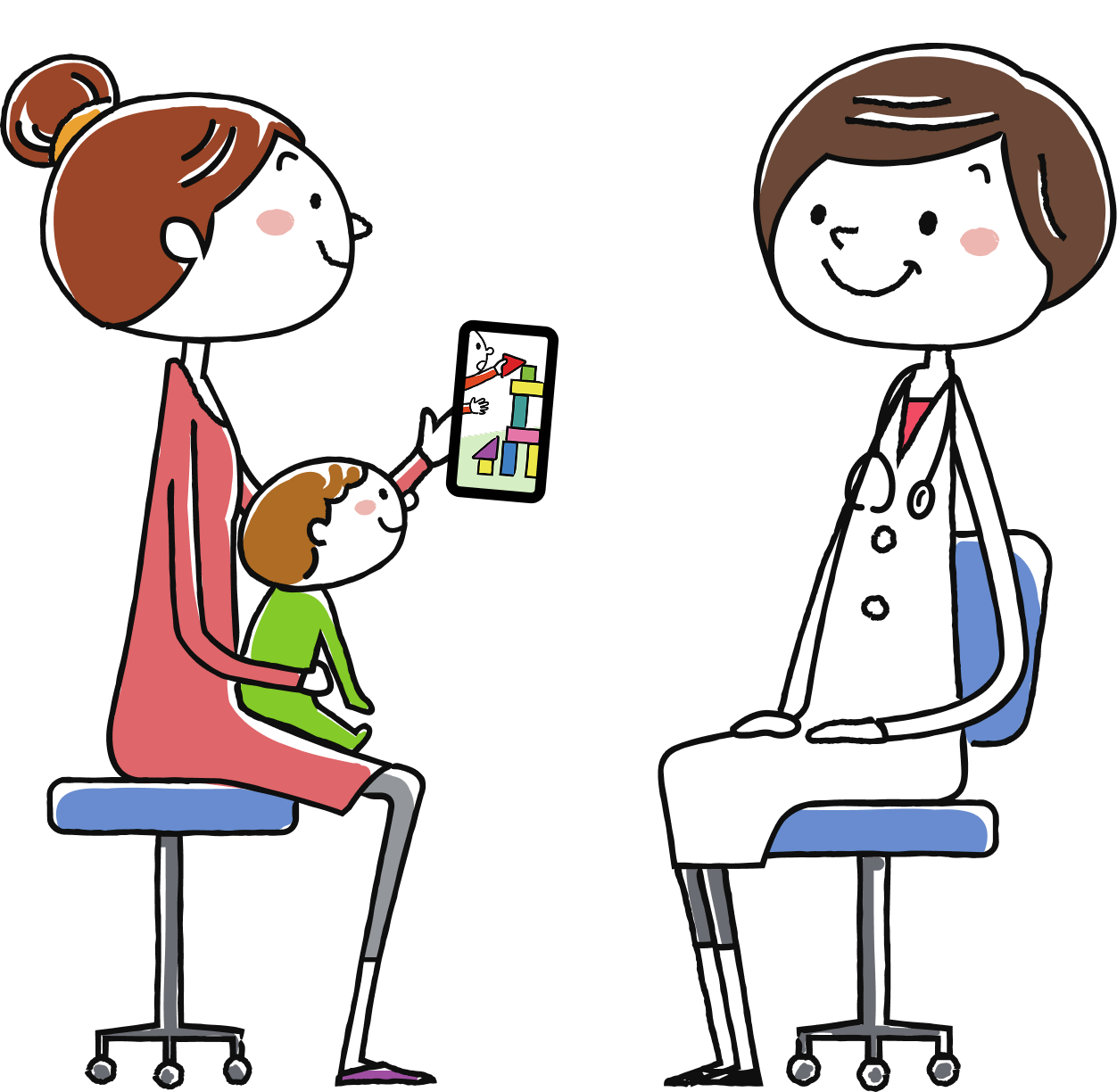
Illustration of a parent showing a video of her child to the doctor seated across from her
Role
Sole designer. Research, product design, design system, HTML prototype, usability testing, and directing the native build.
Status
Actively working on the HTML prototype and testing it on desktop and mobile web. React Native app in progress, iOS first.
Constraint
No backend, no accounts, no upload. Everything stays on the phone.
Tools
Figma. Prototype in Claude Cowork, native build in Claude Code.
Artefacts
Interactive prototype, color engine, decision record, and 1,000+ automated checks.

Illustration of a frustrated parent scrolling through her camera roll on her phone

The problem

A parent captured the moment on their phone, but finding it later isn’t easy.

The seizure at 2am. The chewed iPad case. The bruise nobody can explain. It all lands in the same camera roll buried so quickly. Tagalong helps you pull up your child’s photos and videos easily, whether it’s a doctor’s appointment, an IEP meeting, or an annual assessment.

The approach

Four decisions that shaped the app’s information architecture.

It never moves your photos

Photos are never copied or uploaded. Tagalong only stores a reference to the item in the camera roll, plus your tags and notes.

Every child has their own color

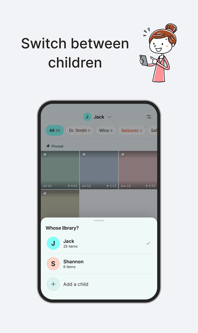
One hue generates each child’s whole palette, so a glance tells you whose library you’re in.

Tags are for reasons

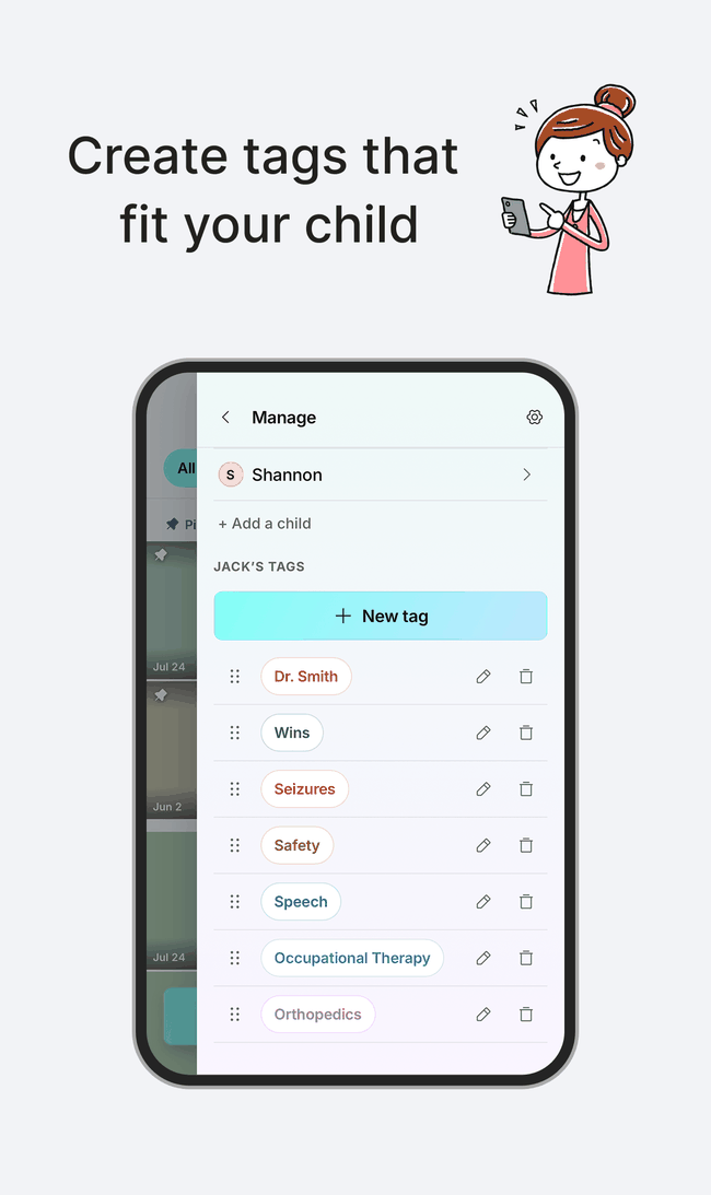
IEP. Seizures. PT. Safety. Wins. Not folders, not albums. Tags follow how you already sort in your head.

Pin what you reach for

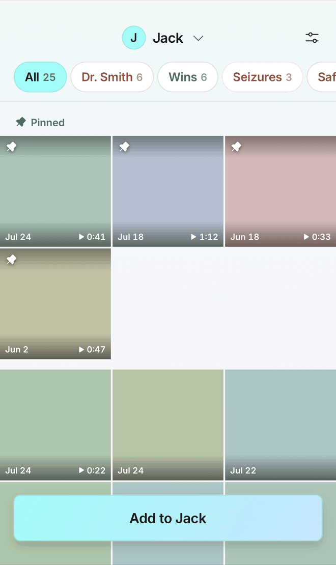
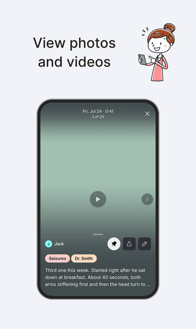
Pinned items sit at the front of your library, so what you prepared for the appointment is the first thing you see.

Try it

The prototype, running here.

Onboarding

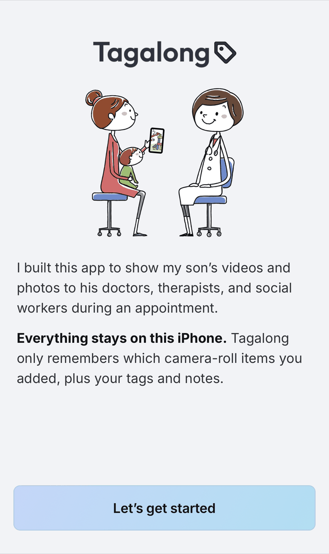
You create a child’s library and a few tags to go with it. Quick to set up, so the app is labelled in your own words before you see it.

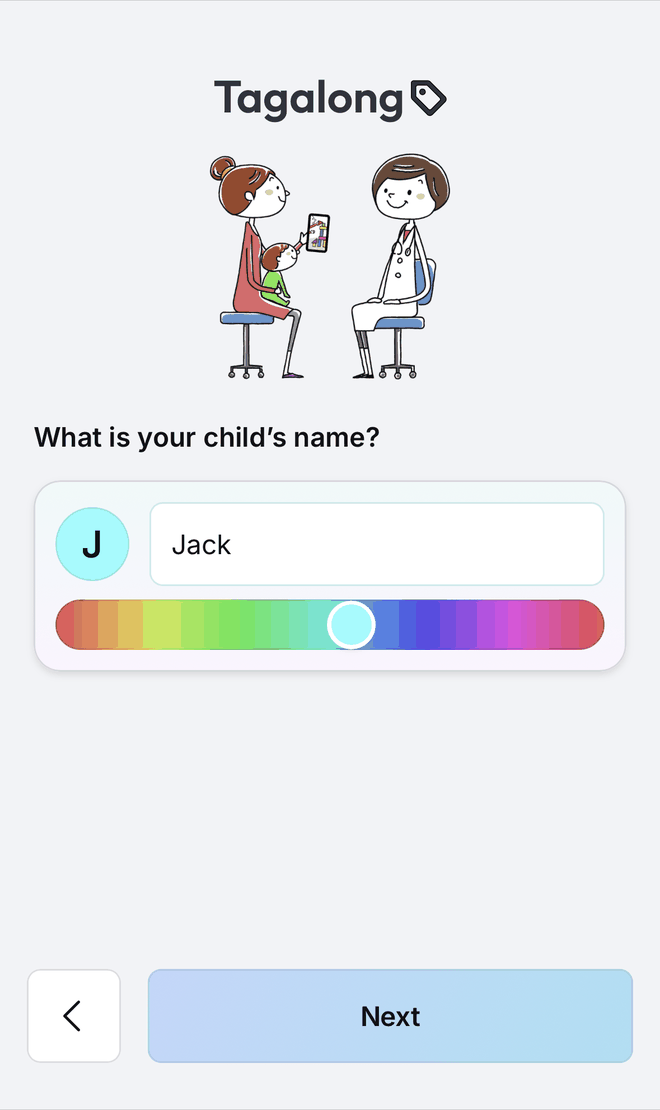
Add a child
The step that asks for the child’s name, with a colour slider under it
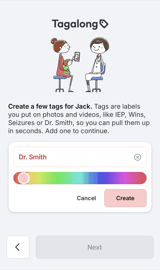
Add tags
The tag creator, with a name typed and a colour chosen

Tutorial video

It is offered at the end of onboarding, but you can also watch it here. It covers the five core features.

Switch between children
Create tags that fit your child
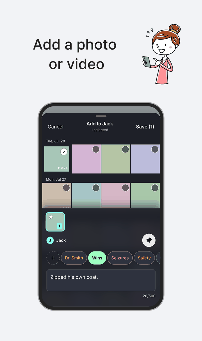
Add a photo or video
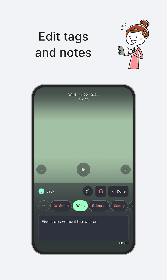
Edit tags and notes
View photos and videos

App with sample data

Try the prototype with sample data. Everything from the video is in here.

Color engine

The palette is derived at a target contrast.

Every child’s color comes from a single hue, and so does every tag’s. Canvas, pills, text, and gradients are all derived from it at a target luminance rather than chosen by eye, so nothing is louder or harder to read than anything else. Because the target is luminance-based, contrast holds across the palette: tag text measures 5.2:1 on white and 4.9:1 on the canvas, clearing AA on both.

Drag to regenerate the entire palette from a single hue

hue 176
KJack Button IEP IEP

These are not screenshots. This runs the product’s own color engine, the same code the app ships.

Design tokens

Values for consistency and scaling.

The values below are shared between Figma and the code. Scroll down to see all the tokens.

Neutral

0#FFFFFFL 1.000
50#F2F3F6L 0.896
100#E3E5EAL 0.783
200#D3D7DEL 0.677
300#C0C5CEL 0.556
400#A0A5ADL 0.374
500#8B929EL 0.285
600#676E7AL 0.154
700#454B56L 0.070
800#2E323EL 0.032
900#1E2028L 0.015
950#0F1117L 0.006

Critical

50#FDECEApalest fill
100#F9EAEAresting surface
300#FF7A7Atext, shape and fill on dark
500#C62828fill on light
600#B3261Etext and shape on light

Info

50#EAF1FDpalest fill
100#EAEFF9resting surface
300#7AA8FFtext, shape and fill on dark
500#285FC6fill on light
600#1E52B3text and shape on light

Text

Hierarchy was achieved through opacity, which maintains consistent contrast regardless of surface color.

Five steps without the walker.text/primary100%17.3:1body, names, titles
Five steps without the walker.text/secondary85%11.4:1supporting copy
Five steps without the walker.text/tertiary65%5.6:1section labels, counts
Five steps without the walker.text/hint58%4.51:1placeholders
Five steps without the walker.text/disabled38%2.4:1disabled controls (below AA by design)
Five steps without the walker.text/criticalcritical/6006.1:1destructive labels
Five steps without the walker.text/inverse-primary100%13.0:1body, names, titles
Five steps without the walker.text/inverse-secondary85%9.9:1supporting copy
Five steps without the walker.text/inverse-tertiary65%6.5:1section labels, counts
Five steps without the walker.text/inverse-hint58%5.4:1placeholders
Five steps without the walker.text/inverse-disabled38%3.2:1disabled controls (below AA by design)

Surface and border

Surfaces alias the neutral primitives. Borders have two levels of hierarchy: “quiet” for dividers and “loud” for object borders.

light-primarycards, fields, sheets
light-secondaryonboarding ground, neutral buttons
light-tertiaryrecessed, disabled
light-criticaldestructive banners
dark-primaryfullscreen photo view
dark-secondarysheets and alerts
dark-tertiaryviewer, fields, chips
dark-criticaldestructive banners
scrim-quietneutral-950 at 40%
scrim-mediumneutral-950 at 65%
scrim-loudneutral-950 at 85%
panelneutral-900 at 92%
border/light-quiet, 8%
IEP
Wins
Seizures
Speech
border/light-loud, 14%
Child name
Add your comment here
border/dark-quiet, 8%
IEP
Wins
Seizures
Speech
border/dark-loud, 14%
Child name
Add your comment here

Spacing and radius

Spacing is used for gaps and sizing, while radius defines corner radius. 6xl is 44, the iOS minimum tap target, and every tappable control in the app is built on it.

none0pxa stated no-gap
xxs2px
xs4px
sm8px
md12px
lg16px
xl20px
2xl24px
3xl28px
4xl32px
5xl40px
6xl44pxtap target
7xl48px
8xl56px
9xl64px
none 0
xxs 2
xs 4
sm 8
md 12
lg 16
xl 20
2xl 24
3xl 28
full 360

Type

Inter is used so iOS and Android render type identically, rather than drifting between SF and Roboto. Leading is percentage-based: 130% for headings and labels, and 150% for body text.

heading-xl32 / 600 / 130%Five steps without the walker.
heading-lg24 / 600 / 130%Five steps without the walker.
heading-md20 / 600 / 130%Five steps without the walker.
heading-sm16 / 600 / 130%Five steps without the walker.
heading-xs12 / 600 / 130%Five steps without the walker.
body-md16 / 400 / 150%Five steps without the walker.
body-sm14 / 400 / 150%Five steps without the walker.
body-xs10 / 400 / 150%Five steps without the walker.
label-md16 / 500 / 130%Five steps without the walker.
label-sm10 / 500 / 130%Five steps without the walker.
label-cap10 / 700 / 130%Jack’s tags

Shadow

Elevation on light backgrounds. Blur is always twice the Y offset, and alpha increases with elevation.

shadow-xs
X=0, Y=2px, blur=4px, 10%
resting cards, text over photos
shadow-sm
X=0, Y=4px, blur=8px, 12%
shadow-md
X=0, Y=6px, blur=12px, 14%
CTA
shadow-lg
X=0, Y=8px, blur=16px, 16%
a row being dragged
shadow-xl
X=0, Y=20px, blur=40px, 30%
modal and alert

Shadow direction is defined by usage. Dark-surface values are heavier to keep elevation visible against dark backgrounds.

shadow-panel
X=-8px, Y=0, blur=40px, 16%
side panel
shadow-sheet
X=0, Y=-8px, blur=40px, 16%
bottom sheets
shadow-rise
X=0, Y=-6px, blur=20px, 10%
compose bar
shadow-dark-md
X=0, Y=6px, blur=22px, 30%
shadow-dark-rise
X=0, Y=-8px, blur=26px, 50%
compose bar

CTA gradient

Used only for onboarding footer buttons. All other CTAs adapt to each child’s custom palette.

Child’s custom palette

Calculated in real time from a single hue selected by the user.